(Originally posted on Blogspot on Wednesday, March 30, 2011)
In continuation of my ‘setting up an internet presence’, I’ve done a ton of work to the design of my site, MikePouch.com. I’ve decided to make it easier to edit, to remove clutter, to make a cleaner looking layout, and to add more useful content.
1. Making it easier to edit: I’ve linked this blog to the main home page, rather than having an HTML news page. It’s very easy for me to sign in to blogger and type up some quick news from any computer, without having to type any html code.
As well, the top ‘link bar’ used to be a jpg. This made it very annoying to have to edit, as I would have to edit a new jpg to add or remove a link. Yikes! Now, when I make a new store page (for instance), I can add a link on the bar in minutes. Nice…
2. Remove clutter: I had each page have it’s own individual ‘news’ page. If I was working on producing an album, there would be news for it under the Mike Pouch Productions page. For my solo album, there was news on the Mike Pouch Solo Music page. If there was news of a film score in the work… film score page… etc. What would happen with this format, is that nothing would ever get updated, and there would be a lot of outdated news very quick. With one single ‘News’ homepage that updates weekly, it simplifies things. As well, if I am working on a film score, album, etc – or something new gets release – you’ll hear about it on the main page.
Also, there was a lot of unused pages, and a lot of ‘coming soon’s. I have removed all of those placeholders, and rather – I’ll just post a link to those pages when I add them.
Some other things I removed were the individual bios for each page. There was one for my film scores, one for my solo, one for my production work, etc. This just led to a lot of uninteresting content, and an excessive amount of outdated content.
3. Make a cleaner looking layout: I decided to make the backing pages white, and the font black. This is pretty basic, but it looks much cleaner than the dark grey backgrounds with white font. Also, I’ve been making effective use of tables! I used to center everything – now all content is formatted to the left of it’s section. Much easier to read!
4. More useful content: While many of the pages are not updated yet, I am posting a lot more music onto the individual music pages (I plan on uploading a lot of music this weekend). And as I stated before, a centralized news update with this blog.
Here’s a sample look of the old design vs. the new design.
OLD:
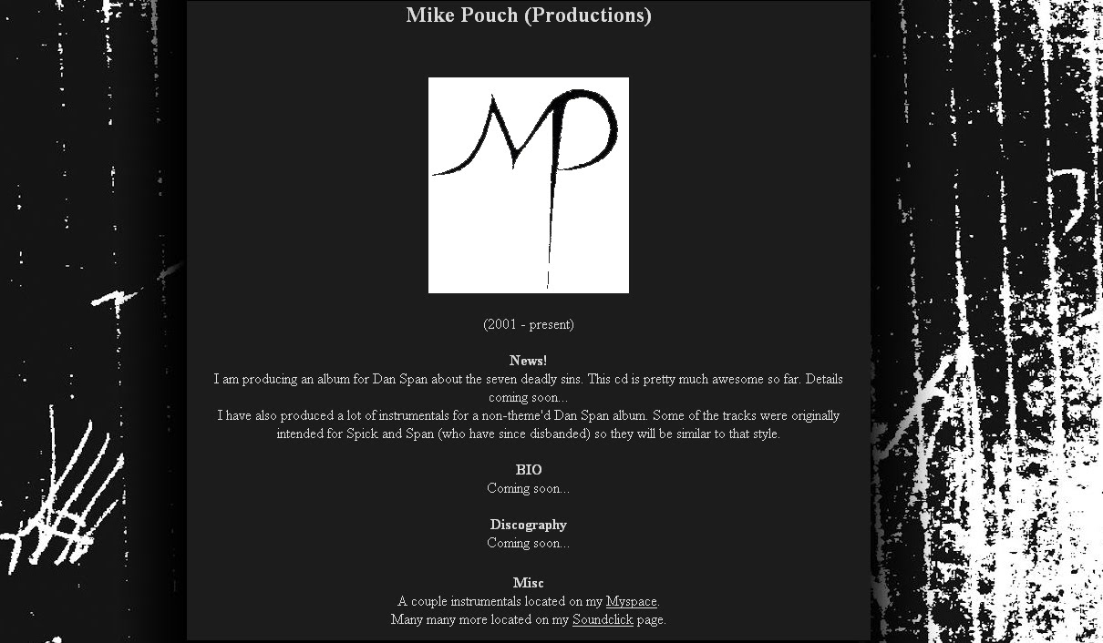
(Lots of ‘coming soon’s that were there for years, lame content, centered fonts, dark backgrounds…)
NEW:
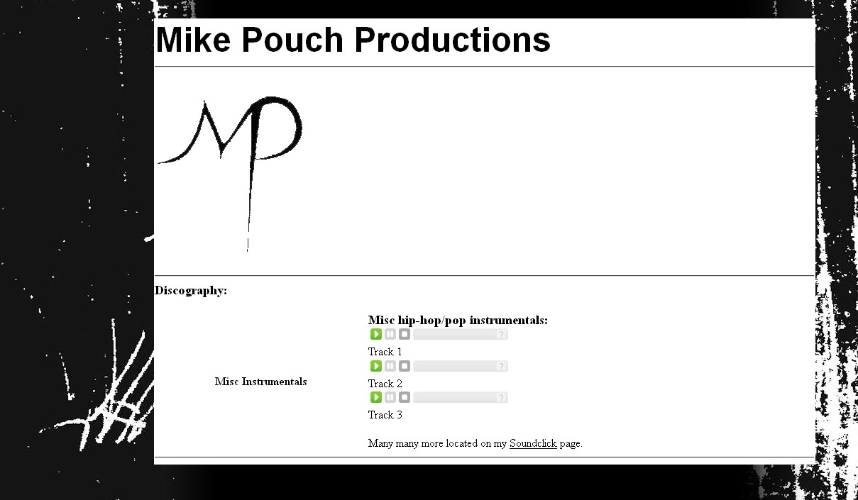
(Cleaner white background, simple content, MUSIC!)
-Pouch!